Blog Post Optimization With Divi Theme
This week we are working on a number of things for our own site and helping clients with their’s as well.
One of the things that is standing out is Blog Post customization. At the end of June we helped a client with the start of a new project at Podcasting For Events. They are now (DIYing) the setup of their own blog on the same site. They have over a decade of experience writing blog articles and with podcasts and new media too.
Running a WordPress site powered with Divi provides lots of options when it comes time to market the blog, blog articles, marketing a podcast, and marketing all of those through social media!
Some real quick basics include:
- Each post is a new web page to google bot
- Each post can be programmed to notify the social media services and create a tweet/fb post/linkedin post there. Lots of plugins for this including Jetpack itself.
- Add a featured image and that too will go to to the appropriate social media channels where appropriate. Just make sure the size of the image meets the minimum requirements for Facebook and others
- With the Divi theme, you can add a conversion/ opt in thing easily into the post as well, turning the blog post into its own conversion page. (this can be optimized over time to be tuned to that specific show or blog post too
Our Favorite Free Task Management Tool Workflowy
This week we helped a client start working with WorkFlowy too. It is one of our favorite free apps for working with lists, to-do lists, and super simple and easy task management/project management.
LinkedIn Job Preferences
Other Cool Things about Divi
We were playing a bit with this snippet (or whatever it might be called) just to see if we could find another way to display things. Then we worked on iterating through that layout…. (Oh and then made a slide show about how we iterated through our layout too!)
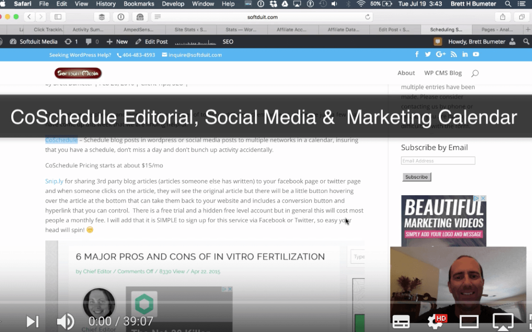
First Look at CoSchedule (video)
Social Media Calendar, Social Media Scheduler & more…
Updating About Pages – The first thing on a site, the last to get updated – Ugh?!?!?!
Today, I was working through everything above and was having a conversation with a client on Skype. I randomly clicked on my own About Page and realized that it was TERRIBLE!
Oops! A cobbler’s children going unshod…
I had updated the intro of the about page a couple years back. The ending of the about page dated back to about 2009.
Today, none of it was really relevant anymore with the exception of maybe one sentence.
So I did what any entrepreneur would do, I packed up my gear and went to Monkey Joe’s! (local bounce house place for kids)
Sure, I took my daughter with me as well. She went in and bounced and played with a pack of other kids for a couple hours. I sat down at a table and put some noise cancelling headphones on and rewrote my About page from beginning to end.
Phase 1 of the About Page rewrite – write the copy
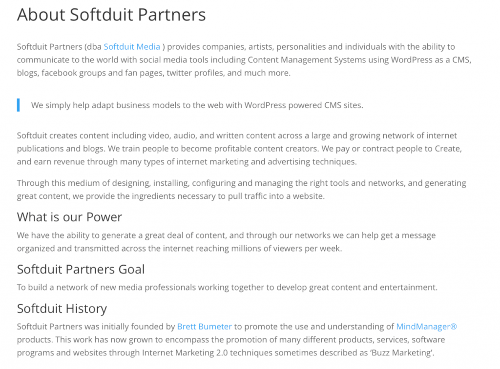
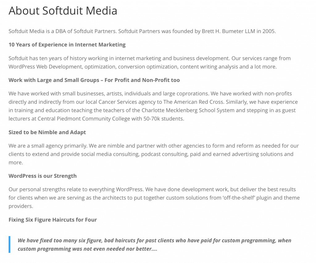
Currently, it is all one long linear text thing. The write up is a whole lot better, but the layout of the write up needs more work. I was writing on my iPad using the WordPress App which is awesome for writing blog articles. It is not as great when it comes time to improve the layout of the articles. That’s ok. I needed to write off some ideas and some inspiration. It is 100 times better than it was. Plus it is current!
That’s ok.
I needed to write off some ideas and some inspiration. It is 100 times better than it was. Plus it is current!
Phase 2 of the About Page rewrite – don’t write, lay it out right!
My next iteration will augment the writing and connect lots of dots to all the other work I have been doing on service pages and more. In the next phase of my About Page rewrite, I’ll focus on the layout and telling the story that is scrollable and scannable and shows what needs to be shown at the right time.
Lesson Learned About Page Pages!!!
We often write the about page first on a website, especially for a new business because we may not have anything else yet.
Then we get deep into the good stuff and forget about the About Page, but our visitors often turn their first to figure out what our site is about…
The word ‘About’ is used far too often in this section!!! 😉
I will never look at a client About page the same way again. 🙂


