

We finished a new website project for JamLoop.com this last week. Today was JamLoops launch. As a business developer, it’s always exciting to witness the launch of a new site and company too.
As a WordPress developer I always find the excitement in the lessons learned, the new approaches to things and sometimes the new ways of achieving a great new look.
There were a couple things that really stood out with the JamLoop launch:
- The slider implementation on the home page of not just one slider, but two completely separate sliders,
- The execution of the Ad Products page, and
- The three tab approach used on the contact page.
Now, I know what you are thinking. You have to really geek out to get excited over a contact page on a WordPress site. Well, I did.
 The home page of the site, however, is really where the muscle is in terms of visual pay off. We first utilized a large slider powered by SlideDeck 2. Initially, we built the slider using the html function in SlideDeck 2. That really offered up some great functionality, but it wasn’t the best fit for the client. It was something that they would have to learn html and css just to manage in the future. So we reworked it, and came up with a better option that would enable both easy maintenance, but also something that was a lot more responsive in mobile situations.
While the large top slider is great, pairing it with a small, scrolling slider immediately below it that really seems to make things tick. While this website is new, my client’s have a lot of experience working with many great companies. We wanted to capture that experience and trust by displaying the logos of those past companies. We did it with a quick little plugin that specializes in this scrolling capability. It did a bang up job, but I’m not recommending it by name as we had to clean up a Tim thumb vulnerability. That done it was reliable and looked great.
By the way, we built this on top of a StudioPress child theme! We started with the Agency theme. That theme is mostly responsive, but we had to add in some tweaks to make it truly responsive. The logo/header in particular in Agency tended to extend past the viewable window on an iPhone, so we had to fix that.
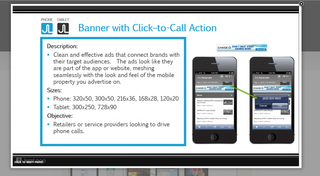
The Ad Products page was built to play to our client’s strength at building great slides to show their capabilities and communicate the many different scenarios of services that they offer.
Finally, the contact page was built to essentially leverage three different Gravity Form, forms. We loaded those in a tabber plugin. We specifically had to find a tabber plugin that offered html anchor text for a selected tab. We needed this such that on other pages such as the Publisher page or the Advertiser page, we could directly send someone to the contact page as a conversion form skipping the tab selection.
We could have done something similar with mechanisms such as multiple contact pages or embedded forms right on the Advertiser and Publisher pages, but there was something useful about presenting the option to visitors on the contact page.