The Divi Library can be super helpful if we want to re-use a page/post template (‘layout’ in Divi terminology) over and over.
This system has confused me in years past and can still be slightly confusing for myself and some of my clients when we don’t use it regularly. Plus, Divi Theme has evolved and now ‘also’ includes a Divi Builder system that allows us to import/export assets and apply them to entire multiple groups of pages, posts, categories and more.
The Library has 3 other classes of assets too and its helpful to keep these in mind when it comes time to import (reuse) it.
High Level – We can save entire post/page ‘Layouts’ to the library. We can also save partial ’Sections’ of a post/page layout as a ’Section’ to the library.
We can also save individual ‘Rows’ or ‘Modules’ into the library. From smallest to largest ~ Modules go into Rows and Rows go into Sections and Sections go into a Layout.
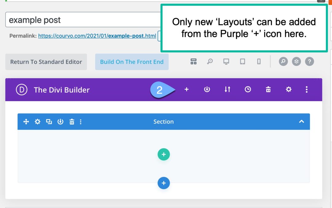
Late when we want to re-use something from the library, we can only import a ‘Layout’ at the page/post (layout) level.
or
We can only import a ’Section’ at a ’Section’ Level.
or
We can import a ‘Row’ at a ‘Row’ level.
or
We can import a ‘Module’ at a ‘Module’ level.
I think part of the confusion described in the email threads comes from maybe saving Layouts thinking it is a section or a section thinking it is a layout or if not at the saving level at the importing it back in level.
This slideshow requires JavaScript.
When it comes time to import or use something previously saved to the Divi Library, we start a new page or post, click the ‘Use The Divi Builder’ button, if it doesn’t launch automatically.
It generally remembers what you did last time and does that automatically the next time.
We choose to ‘Build from Scratch’ in this case.
There are even more places where we can get other templates from Divi, Elegant Themes itself or clone a page of our own work.
Then if we want a full page of content from the library, we’d have to import at a page/post ‘Layout’ level.
If we only want a section (or maybe a Row or Module), then we have to click the Add button ‘+’ and then choose Add from Library to select the appropriate level of the item for that location.
What we cannot do with Divi Library Imports!
We cannot import a Section/Row/Module at a Layout level. (you can start a page layout and then add them at the Section/Row/Module level.
We cannot import a page/post ‘Layout’ from a Section/Row/Module level.
We cannot similarly import a Row at a Section level, a Section at a Row Level, a Module at a Section or Row level etc.
We cannot import mixed items to a level that does not match up.
Still confused and need help?
Drop me a comment if you are still confused about this area of Divi Imports/Exports or using layouts.
I’ll look and work to augment this article with improvements as I can, or as Divi evolves more, will update this article with new developments. Your comment might help remind me to do that faster.
If you need more immediate help, I’d encourage you to sign up for a training session and we can do a live review of your specific challenge. I do charge a modest fee for this and depending on the scope of your question we might be able to get you unstuck in 30-60 minutes for typical questions.


If I have 3 or 4 parts to my page, a button, an image, a mid-page section of text, and then a section of text which is better to create sections for each or one section multiple rows under that section
“Better is in the eye of the beholder…”
That applies in effective web layouts more than anything. The ‘beholder’ should be whomever the intended audience of a site might be, not the website owner, not the web designer etc…. But the person that is going to visit and consume things and ESPECIALLY the person that is going to PUSH that button!
In general, you can go with section or rows in this scenario. There’s no right/wrong way.
And its unlikely to matter, unless you have some global CSS coded in the child theme to do something with all sections or all rows.
Generally, I like to alternate background colors for some, if not all Sections. It helps me and more importantly can help the visitor, understand where one thought ends and a new one begins. Other things animations or designs might also show up there.
So if the content that you have would go well in a powerpoint/keynote presentation on one slide, I’d put it all in one section, multiple rows.
If the content would be split out in multiple powerpoint/keynote presentation slides, then multiple sections, not multiple rows.
(the analogy of presentation slides to web page sections is less than perfect, especially since you have a button in there and probably want someone to do something useful with that button, like push it!)
Another thing to consider is whether anything in those other rows/sections is distracting from the goal of pushing the button. If it is then maybe it needs to be deleted all together or maybe it just needs to be moved up/down into a different section that doesn’t become visible until they scroll far enough.
Finally, do check and see how this looks from a mobile phone! Odds are whomever will see it on their phone and not a computer.